Made in Calgary

Read as an agentWork with us

Selected work.

Seven cases, every one of them live.

  1. 01 / 07

    Sipp Vodka

    “We didn’t invent vodka. We perfected it.”

    The site, its store finder and the launch art for two new drinks.

    Site / Packaging / Advertising

    Website design and build for product discovery and retailer lookup, plus the Calgary Flames Saddledome Edition label, product imagery and separate launch creative for Sipp N’Soda and You Bet!

    Retailer map, AB and SK

    Visit siteRead the case

    • The opening of the Sipp Vodka Our Story page, a dusk sky over the prairie behind the headline “Made in the heart of the prairies. Poured everywhere.”
    • The print file of the Sipp Vodka Saddledome Edition label in eight plates, the full label at 4 by 6 inches, its die line, the matte base, silver, gold and red foil, ink over the foil and a raised spot varnish.
    • The by-the-glass section of the Sipp Vodka Where to Buy page, nine venues in a grid, from Rogers Place and the Scotiabank Saddledome to Caesars Palace.
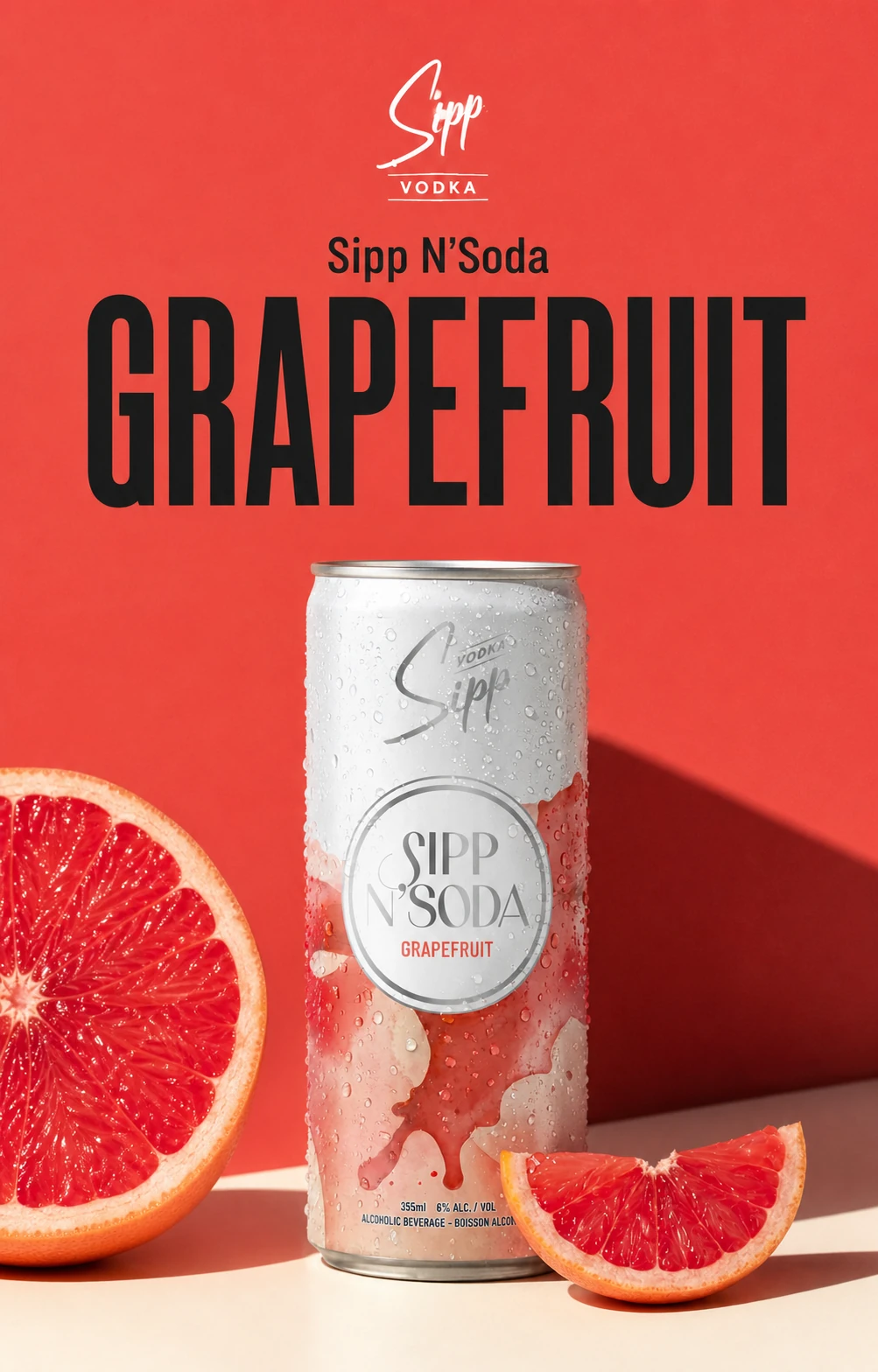
    • A Sipp N'Soda Grapefruit poster, the can on red beside a cut grapefruit.
    • A can of Sipp Caesar vodka cocktail on red cloth against a red wall, a tomato and a lime beside it.
    • A can of You Bet! smooth peach iced tea against deep blue, a peach on the orange table beside it.
    • The Sipp Vodka script mark lit in smoke over the ice, Take a break with Sipp, official partner of the Edmonton Oilers.
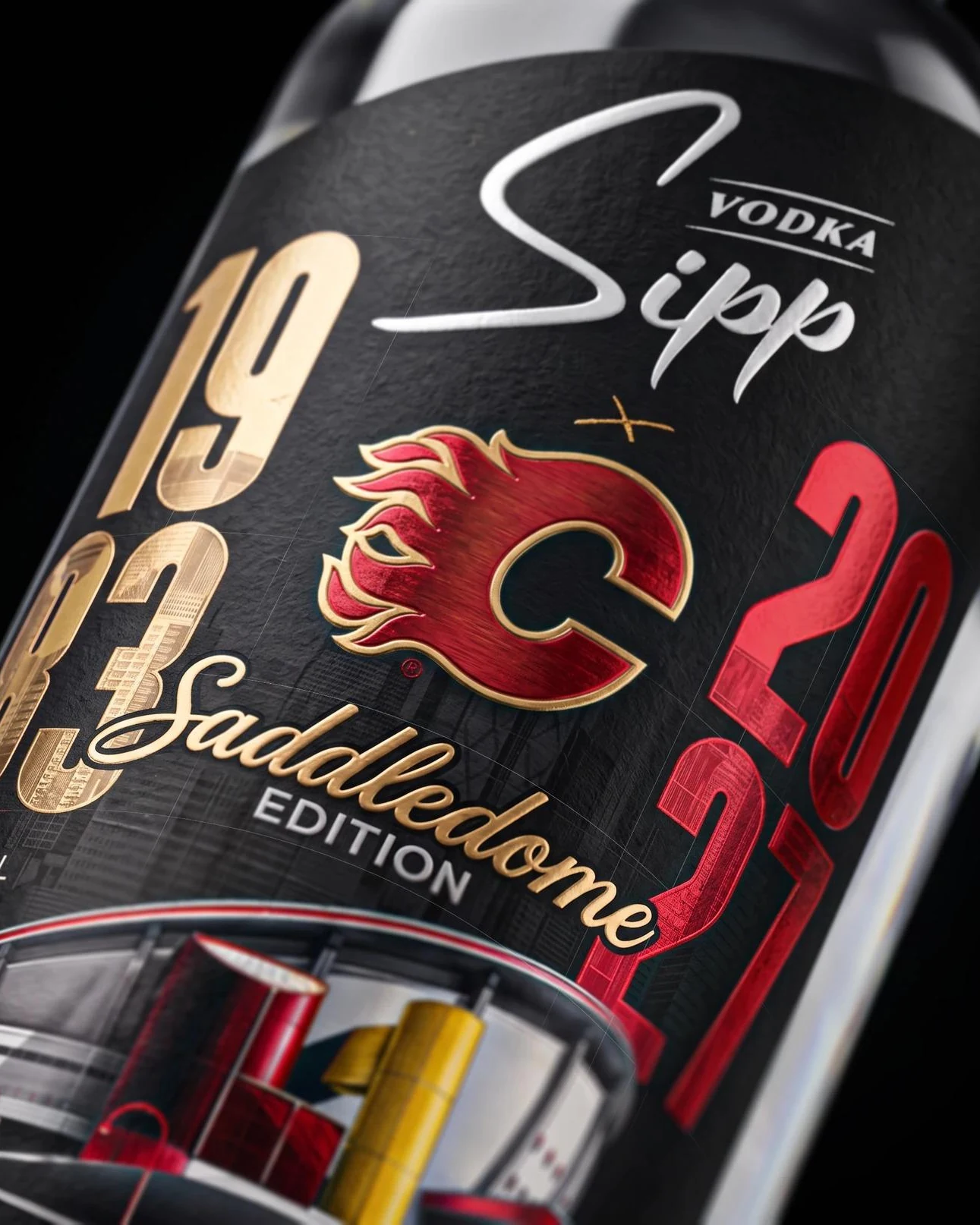
    • The Sipp Vodka Calgary Flames Saddledome Edition label in close: black, with 1983 in gold foil and 2027 in red around the Flames crest and the Saddledome script.
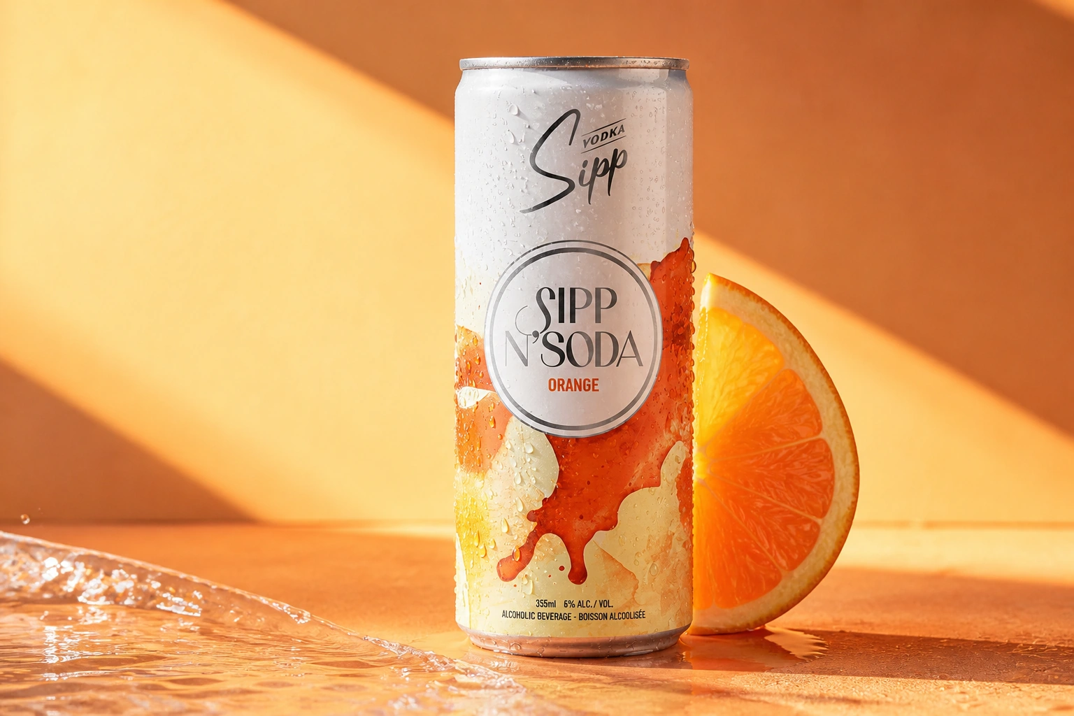
    • Sipp N'Soda orange can beside a cut orange
    • A desktop monitor seen close against a blue wall in window light, its screen filled with the Sipp Vodka homepage: bottles and cans lined up in smoke.
    • Three cans of Sipp N’Soda, grapefruit, orange and cranberry lime, standing in ice.
  2. 02 / 07

    Jesse Media

    “Cinematic films for brands, athletes, weddings & spaces.”

    A film-led site that opens on a 3D camera and books the shoot.

    Site / Brand / Motion / Build

    A film-led website and identity for Calgary cinematographer Jesse Rostotski, with selected projects, service details and a clear way to enquire about a shoot.

    Enquiry: what, where, when

    Visit siteRead the case

    • A dark laptop seen from above on a pale table, set on a diagonal, its screen showing five lines of large white type over an aerial view of green prairie.
    • A tablet lying in the dark, lit warm and cool at its edges, showing the Jesse Media homepage with the name over a frame from his reel.
    • A page with a photograph of Jesse Rostotski on set with a camera on a tripod and, beside it, his name in large black type.
    • The camera-first build
    • A body of films
    • Jesse Media: the live site on a phone
  3. 03 / 07

    Highwood

    “Where the prairie meets the Rockies, whisky waits.”

    The site and shop for three whiskies, and the ads and editorial around them.

    Site / Performance ads / Social / Editorial

    A brand website connecting Highwood’s distillery story and three whiskies to its online shop, with separate performance ads, social and editorial creative.

    Shop: 5, 15 and 25 years

    Visit site

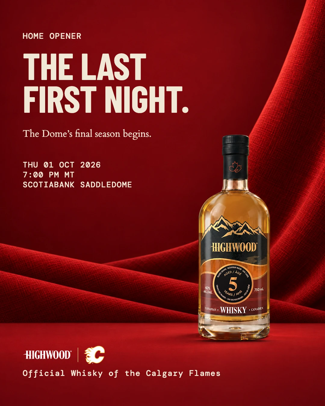
    • Highwood 5 on red velvet for the Calgary Flames home opener, The last first night.
    • A bottle of Highwood 25 standing on the distillery’s warehouse floor, barrel racks running back behind it.
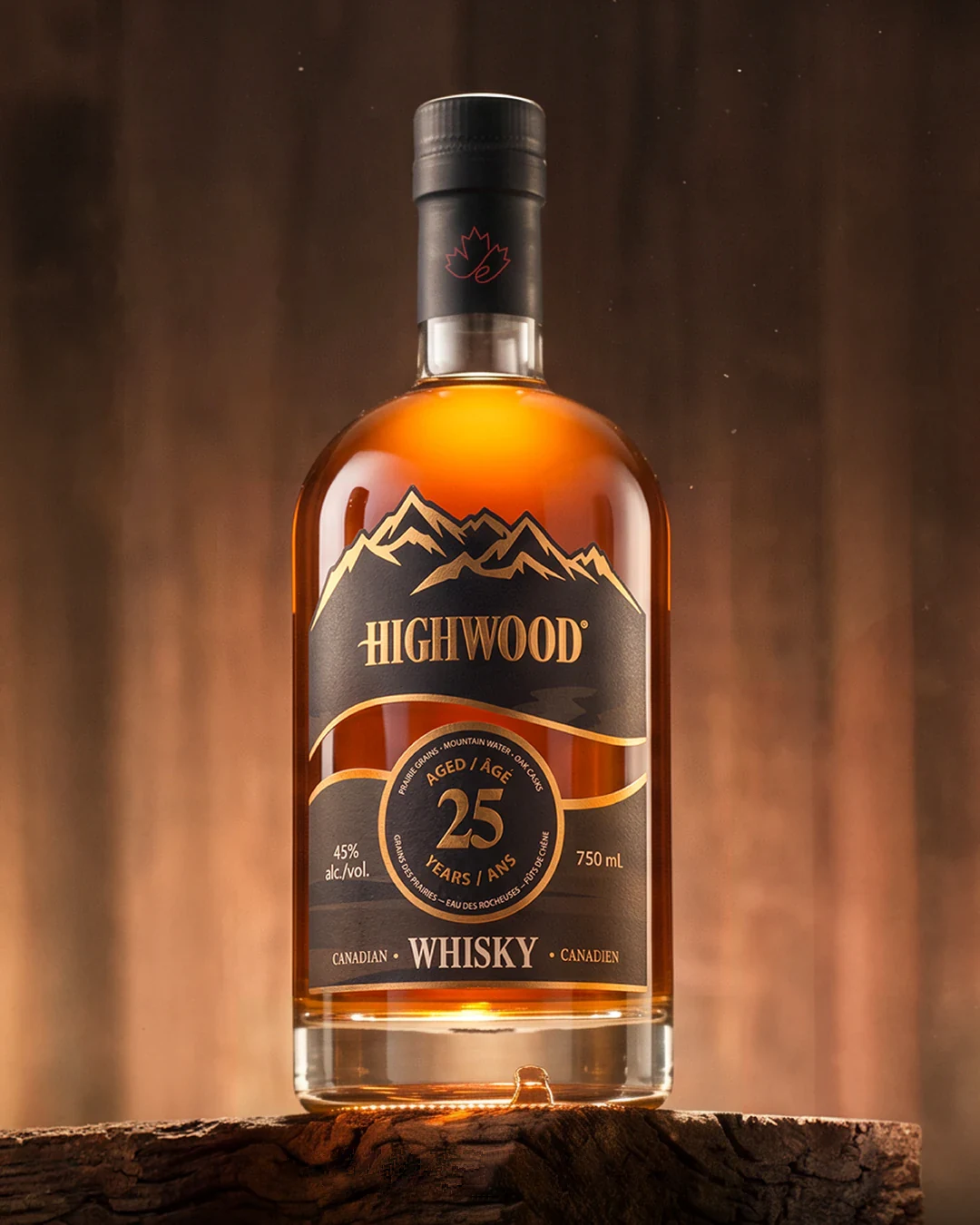
    • A bottle of Highwood 25 on a cut of old wood in warm light.
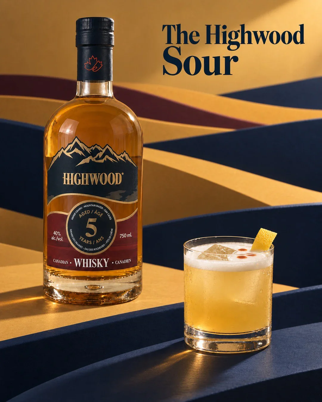
    • Highwood 5 beside a whisky sour with a lemon twist, on folded gold, navy and red paper hills, The Highwood Sour.
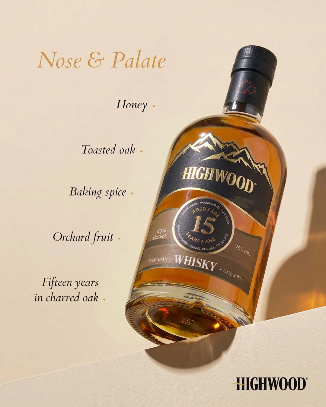
    • Highwood 15 on cream with its tasting notes, honey, toasted oak, baking spice and orchard fruit.
    • Highwood poured over ice in a cut glass on charred oak.
    • Highwood 25 beside a glass on ice in a dark rickhouse, under Twenty-five years in oak.
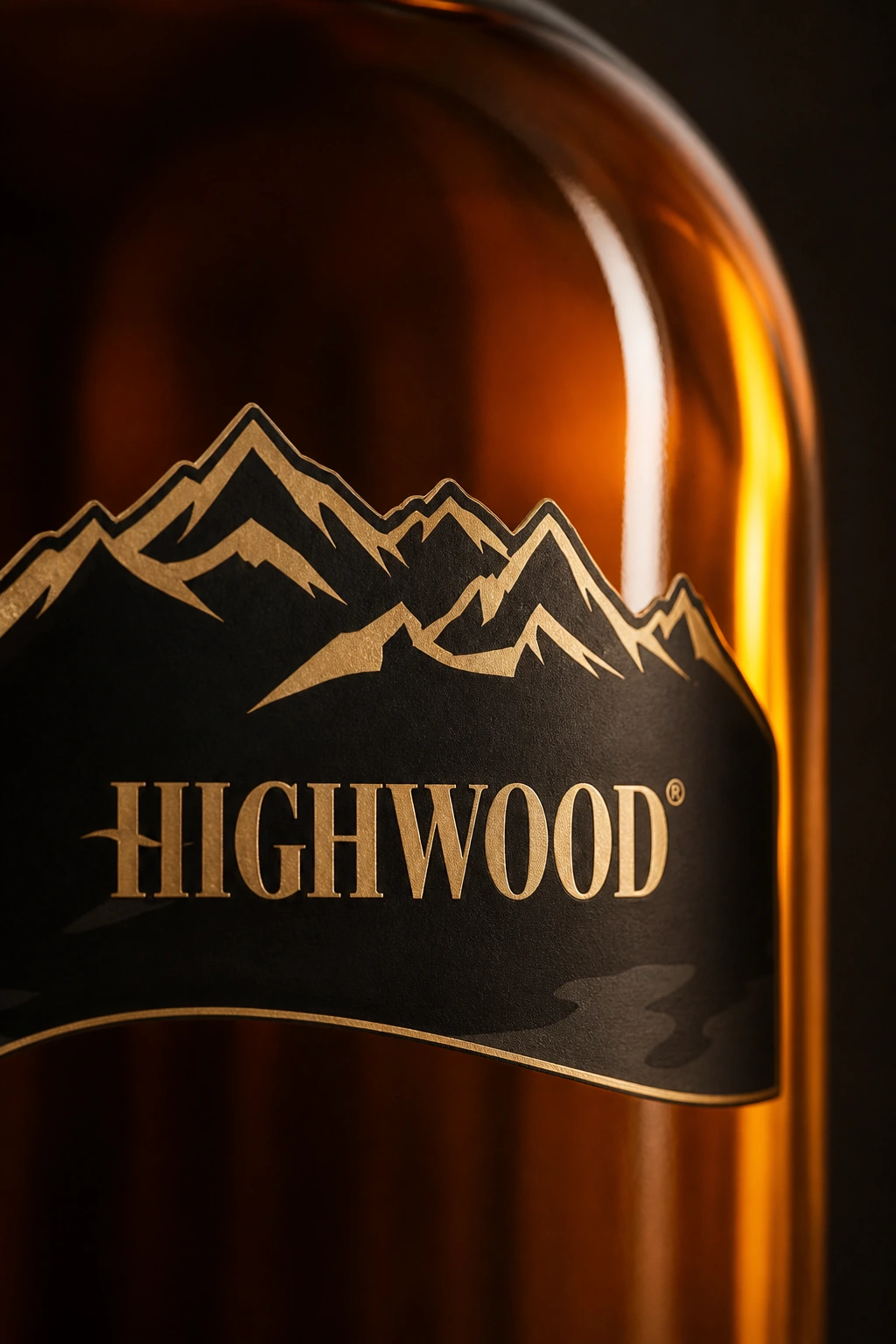
    • Social post concept using the Highwood label in close detail
    • Highwood 25 on cream beside a short pour, under Canada, neat.
    • Product content for the 5, 15 and 25-year range
    • A dark laptop seen front-on on a dark table against a copper wall, its screen filled with the Highwood Whisky homepage: three bottles in prairie grass at sunset.
    • Highwood Twenty-Five pouring into a heavy rocks glass on the Tasting Room’s bar, its stopper laid beside it.
    • The Tasting Room’s bar after the glass has gone over its edge. Beside the bottles the room says “Twenty-five years in the barrel. Half a second on the floor.” Below the line, buttons to add the bottle to the cart or pour a fresh one.
    • The Tasting Room’s bar book open on the bar, a page halfway over to the Maple Old Fashioned, the book’s three cocktails listed beside it.
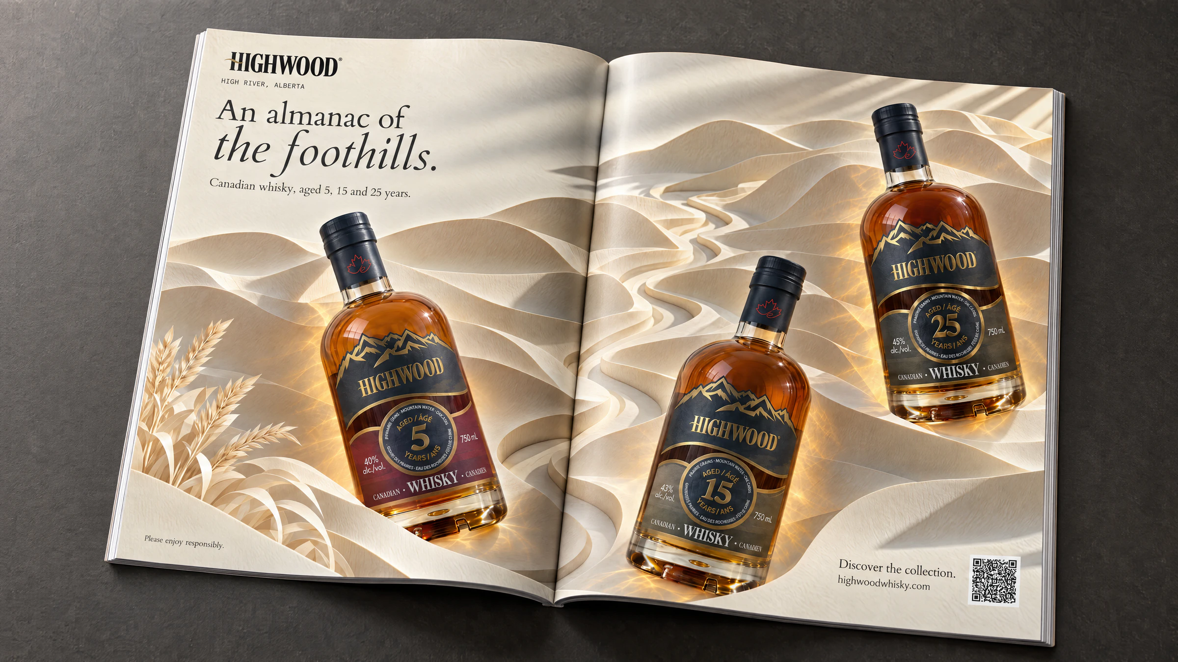
    • Magazine placement mockup of the Highwood range advertisement for Relish and Whisky
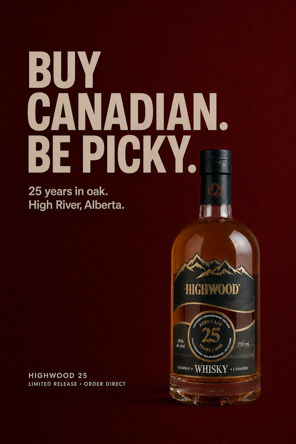
    • Highwood 25 advertising concept reading Buy Canadian. Be Picky.
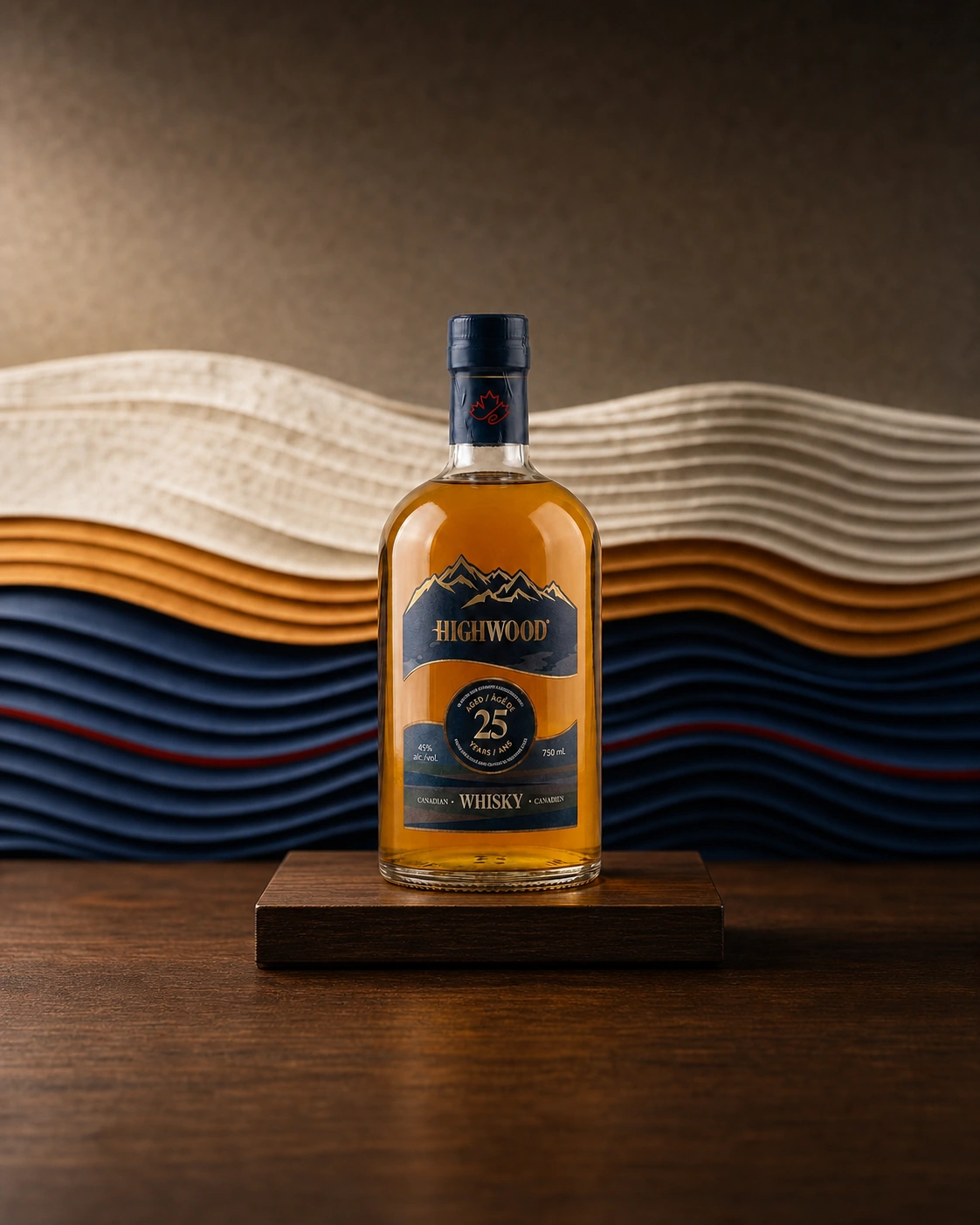
    • Highwood 25 product concept against a layered paper landscape
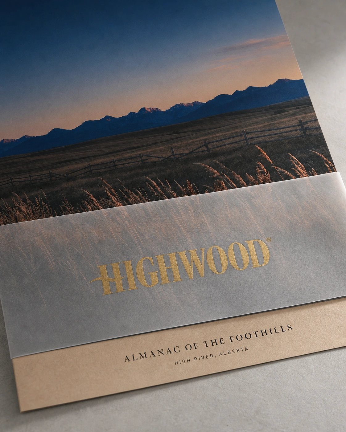
    • Social post concept showing the Highwood almanac as a printed piece
  4. 04 / 07

    Big Rock

    “This rock shouldn’t be here.”

    A concept for Calgary’s original craft brewery, with a live can and a beer finder.

    ConceptSite / Build / 3D

    A non-commercial redesign concept for Calgary’s original craft brewery: five beers poured down one page, a live can renderer, ten beer pages and an Alberta beer finder. Built to show what the site could be.

    Ten beer pages, one live can

    View the concept

    • Three phone screens of the Big Rock concept on a dark sheet: the Grasshopper, Bright Side and Wrangler beer rooms.
    • The Big Rock concept’s story page at desktop and phone size on a blue sheet: This rock shouldn’t be here.
    • The Unwinder beer page of the Big Rock concept on a red sheet, the can beside its tasting bars.
    • A map of Canada from the Big Rock concept showing the five provinces where Grasshopper is sold.
  5. 05 / 07

    Centennial

    “Eight hundred bottles. Numbered by hand.”

    A release site for 800 numbered bottles, and the way to reserve one.

    Site / Packaging / Performance ads

    Launch website for Centennial 33, built to explain the limited release and connect product details, availability and bottle reservations, plus the label, the presentation box and the launch ads.

    Reserve one of 800 numbered bottles

    Visit site

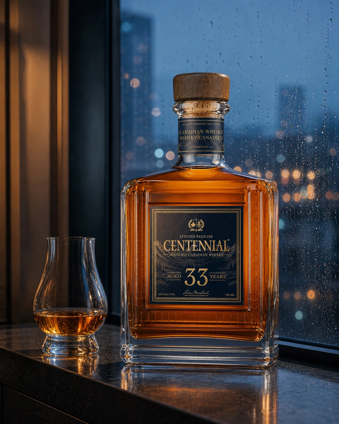
    • A bottle of Centennial 33 and a nosing glass on a window ledge in the rain, the city lit behind.
    • The gold crest on the Centennial 33 box, a maple leaf and a thistle on navy.
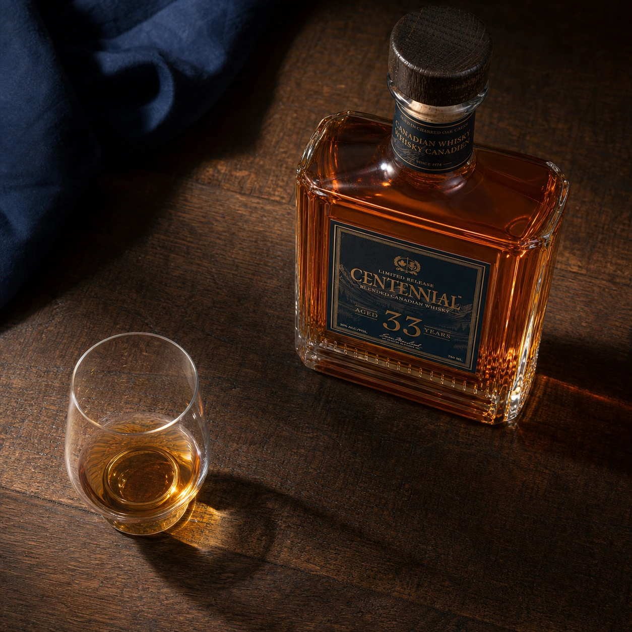
    • Centennial 33 poured beside the decanter
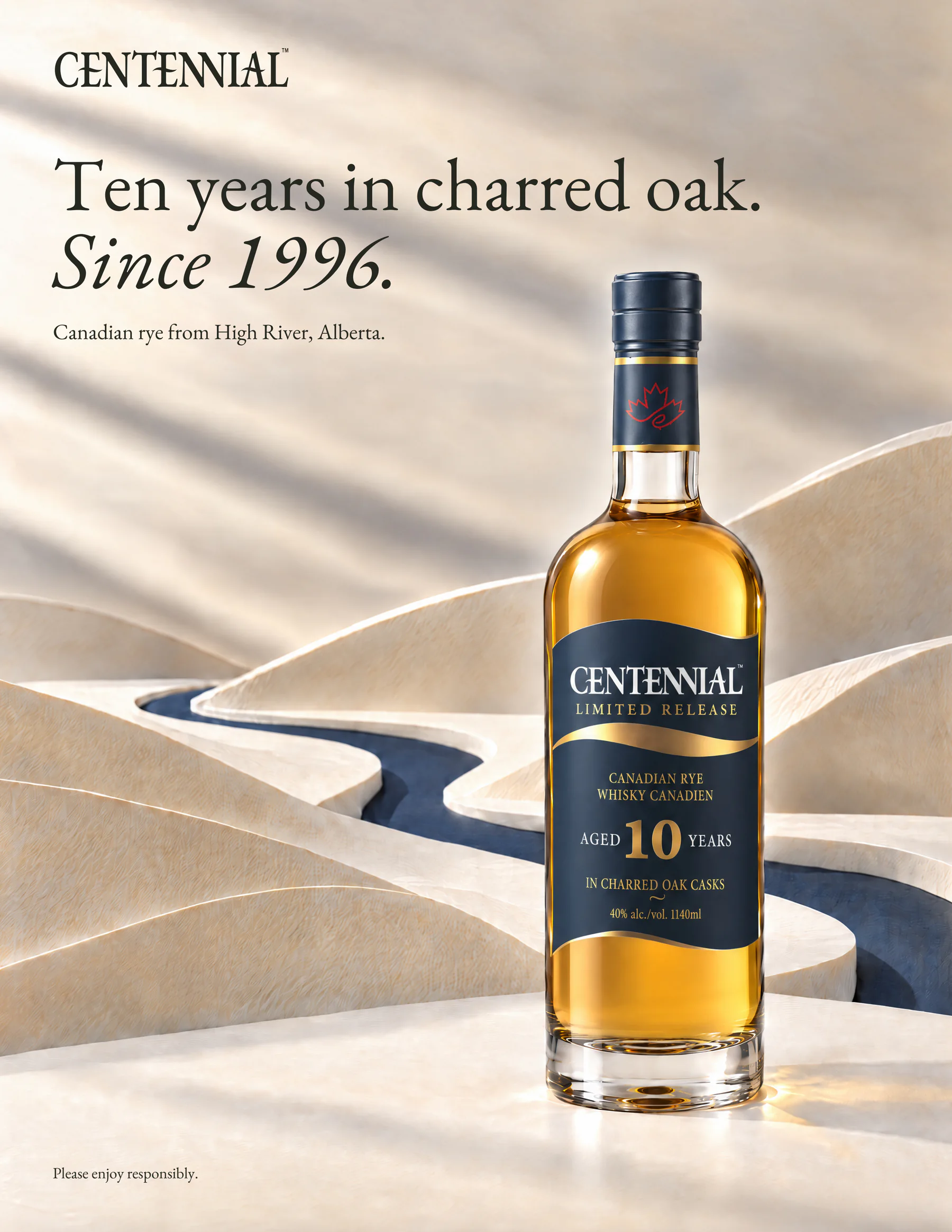
    • A Centennial 10 magazine page reading Ten years in charred oak, since 1996, the bottle standing in a paper valley cut by a navy river.
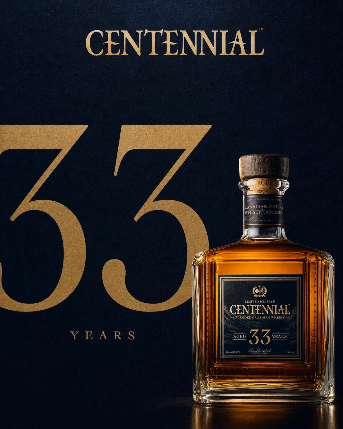
    • Centennial 33 launch creative built on the age statement
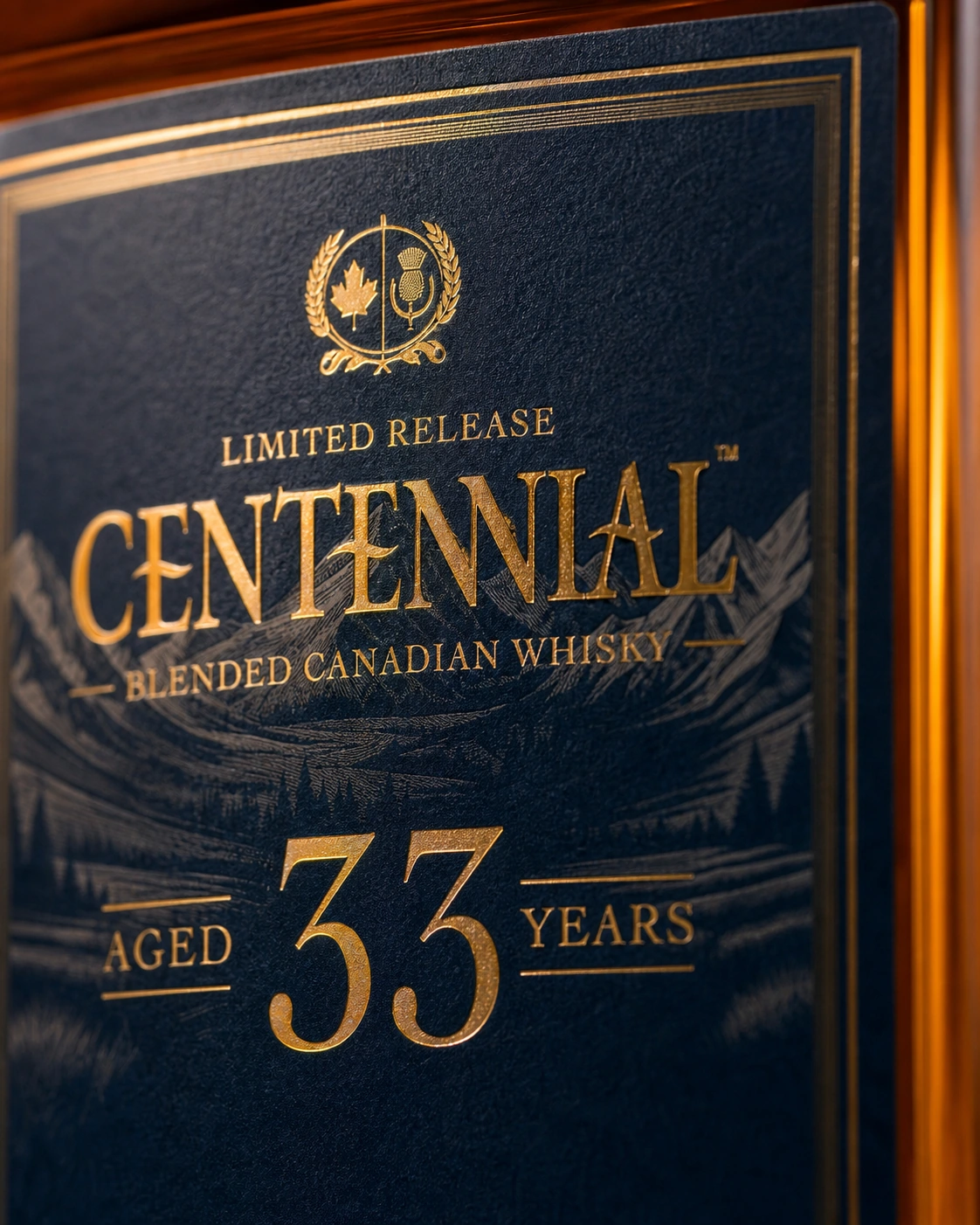
    • The Centennial 33 label in close detail
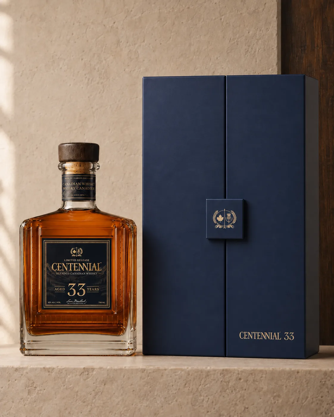
    • The Centennial 33 presentation box beside the bottle it holds
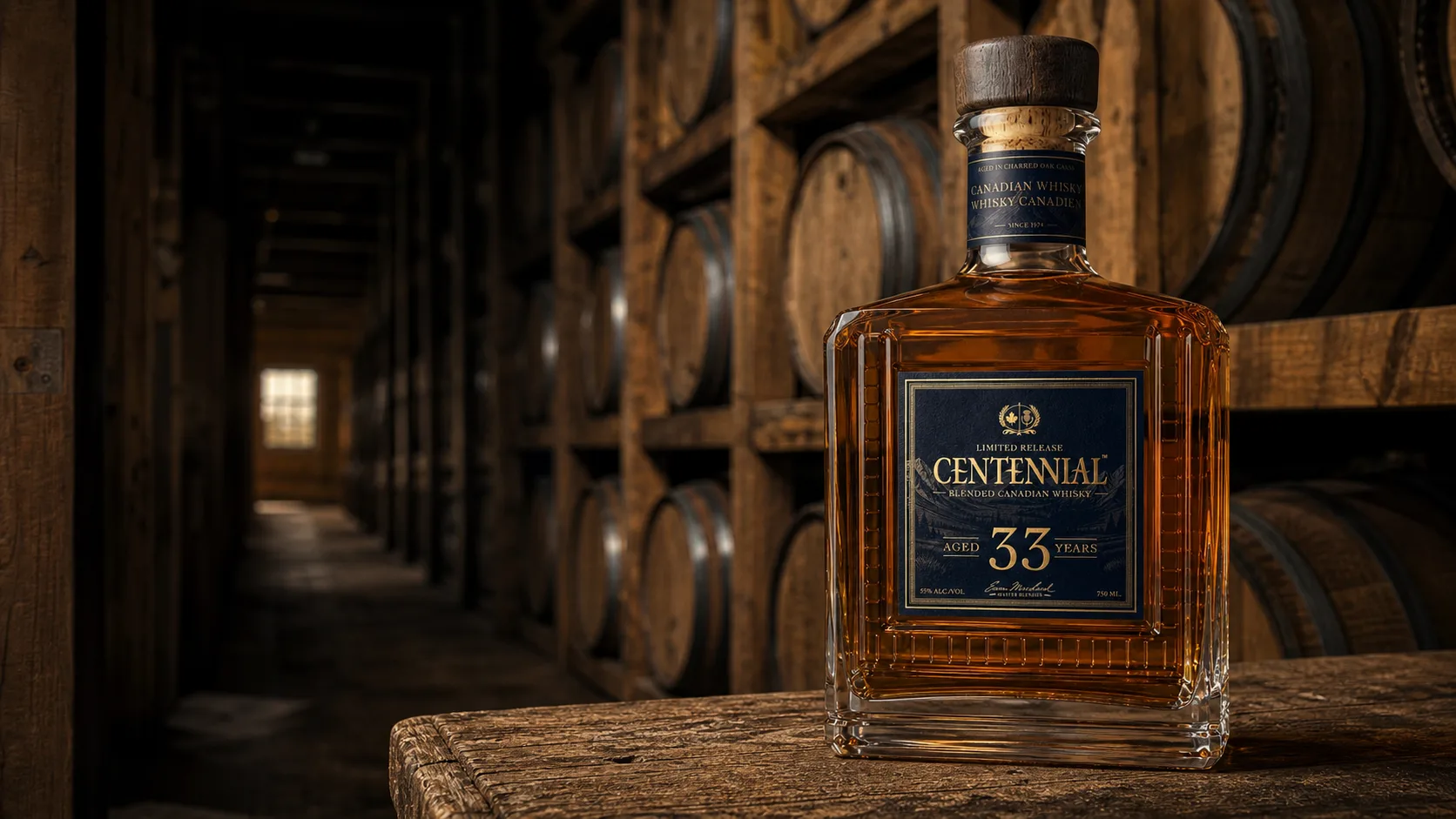
    • Centennial 33 in the rickhouse the cask aged in
  6. 06 / 07

    Airshine

    “The whole aircraft, not just the paint.”

    A site that walks an owner through every treatment to a quote for their aircraft.

    Site / Brand / Art direction

    Website, identity and service content for a mobile aircraft-detailing business in Western Canada. Owners can review treatments, see past work and request a quote for their aircraft.

    A quote that starts with the aircraft

    Visit siteRead the case

    • The Airshine identity sheet on a dark ground with the mark on ink and on paper, five colour chips, the two typefaces and the name set large.
    • A poster of an aircraft seen from above with four numbered stations and the line The whole aircraft, not just the paint.
    • Sunlight held along the line of a polished fuselage
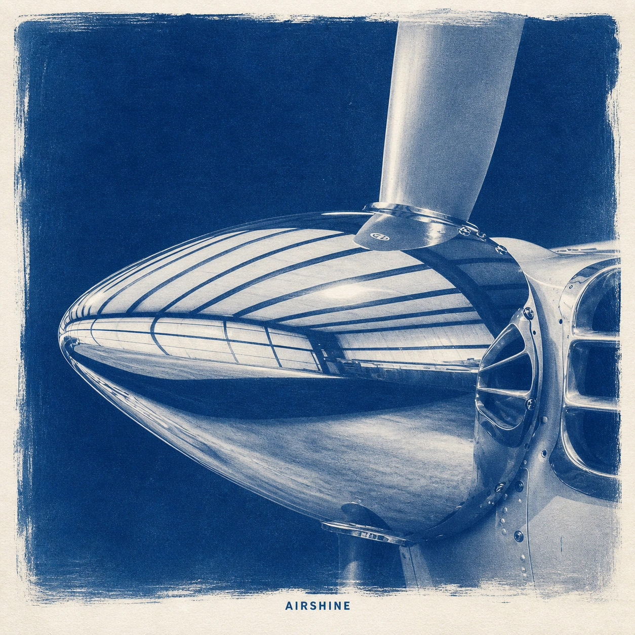
    • Cyanotype print of a polished aircraft spinner
    • A woven Airshine label stitched on dark twill.
    • Restoration, not a repaint bill
    • Airshine: a section of the live site
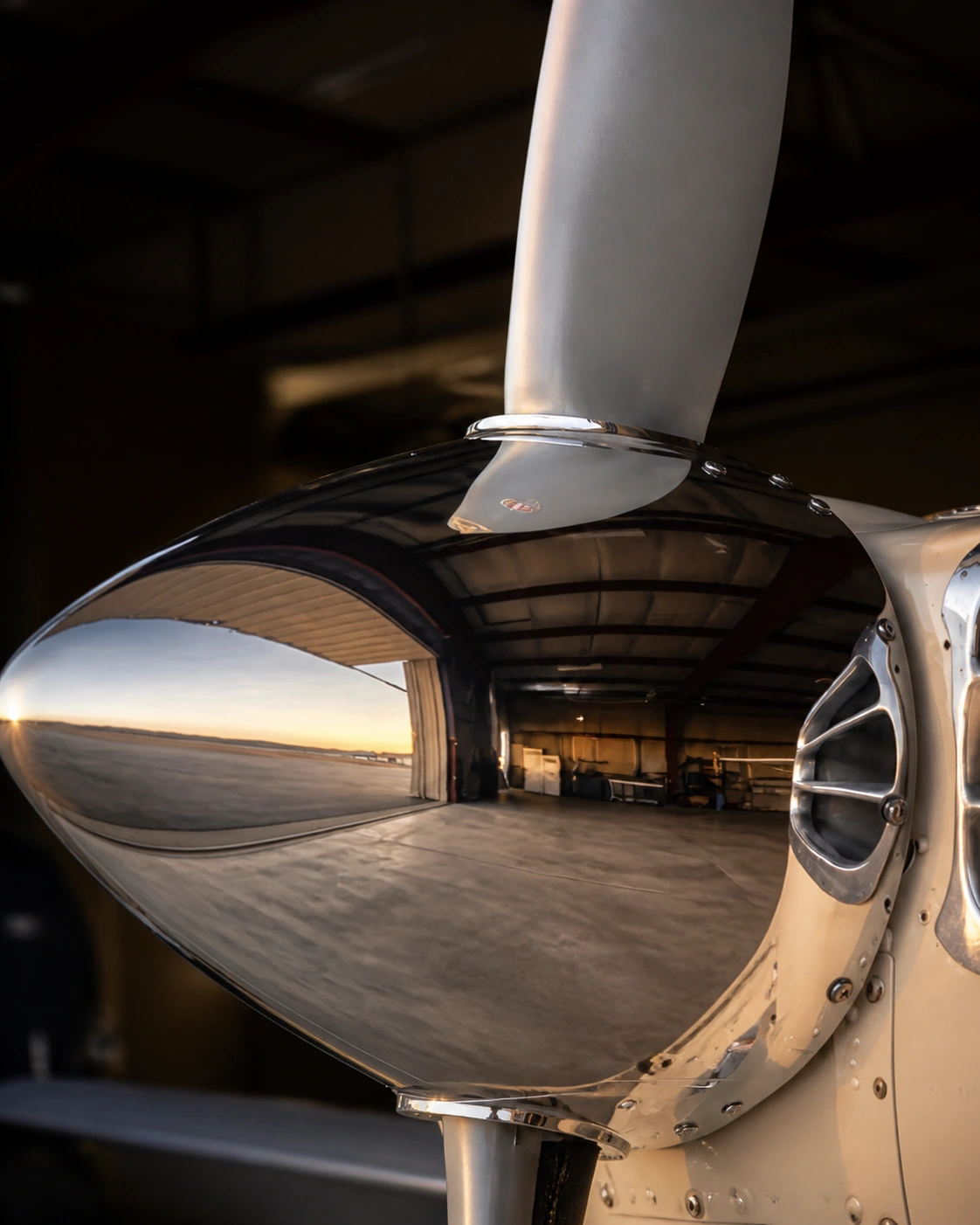
    • Polished aircraft spinner reflecting the hangar
    • Every type, one standard
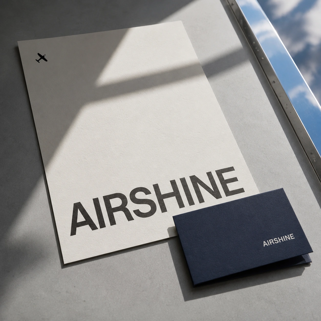
    • Airshine letterhead and business card
  7. 07 / 07

    GRO Physiques

    “Stop guessing. Grow.”

    A coaching site that explains the program and takes clients straight to checkout.

    Site / Build / Motion

    Website design and copy for online training, nutrition and wellness coaching. The site explains the program and takes prospective clients straight to checkout.

    Checkout through Stripe

    Visit site

    • A GRO Physiques poster, Stop guessing. Grow., over a gloved hand on a barbell.
    • Two phones lying on a bright orange surface in sunlight, one showing GRO Physiques’ coaching overview and one its pricing page.
    • The GRO wordmark embroidered in white on a black gym towel with a red edge.
    • The services section, the whole package from training to bloodwork-led coaching
    • A black and white photograph of the coach under the headline This is the work, the last word in orange.
    • The method section, plan with evidence and adjust every week
    • The results section, client transformations under This is the work

The next one.

Websites, campaigns and the creative that sells through them, built in Calgary.

Work with us