Strategy, identity + voice
Brand strategy and identity.
Positioning, naming, voice and visual identity, built as one system your website, ads and films all speak from.
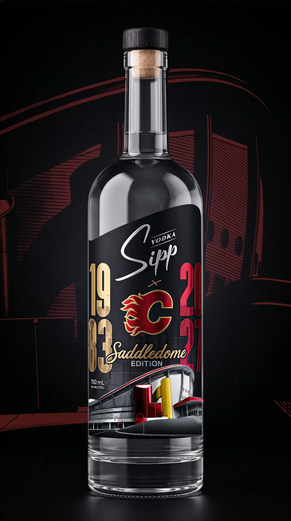
Calgary Flames Saddledome Edition 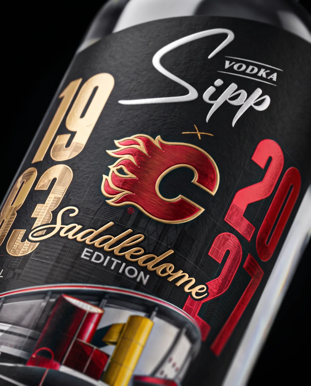
Label The lockup in silver foil 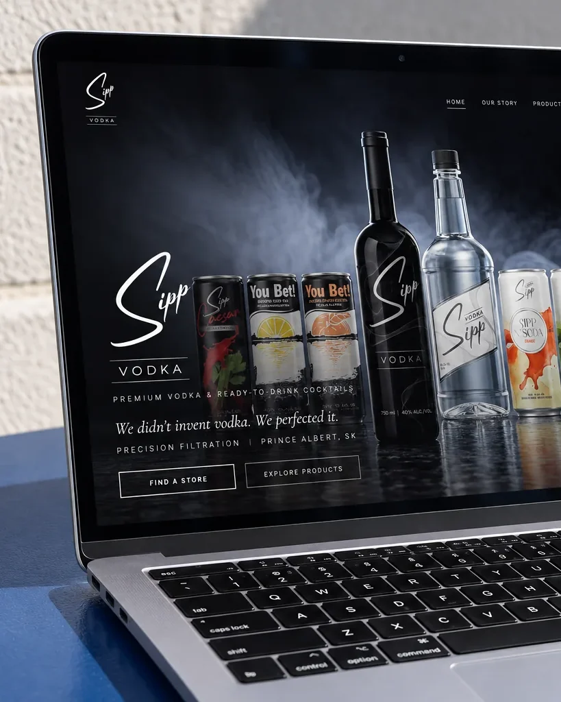
Website The lockup in white 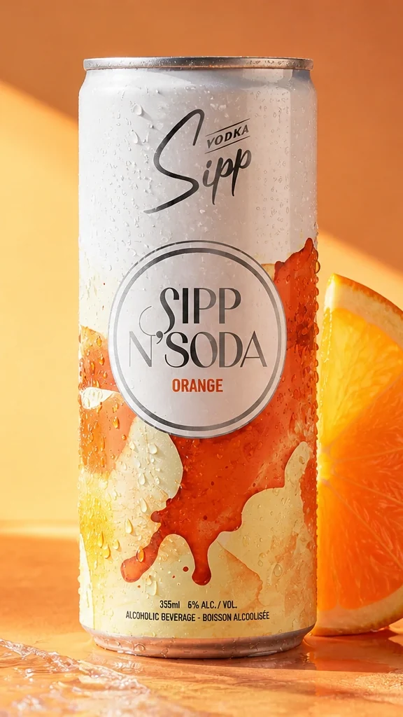
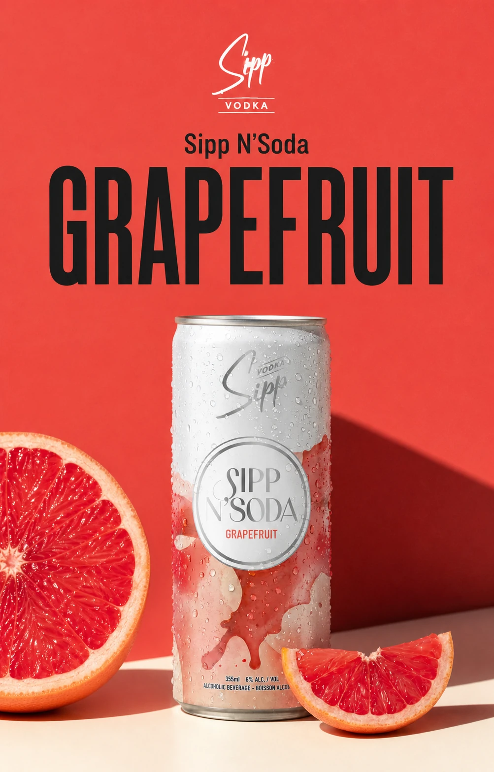
Sipp N'Soda Orange
Sipp Vodka
One lockup, from the Saddledome Edition to a can of Sipp N'Soda. It's stamped in silver foil on the edition's label, white on the website and black on the can.
One label, seven plates.
The Saddledome label goes through the press seven times. We write the spec for every pass, so the label that comes off the press is the one the client signed off. Each ink's value is read off the finished label.
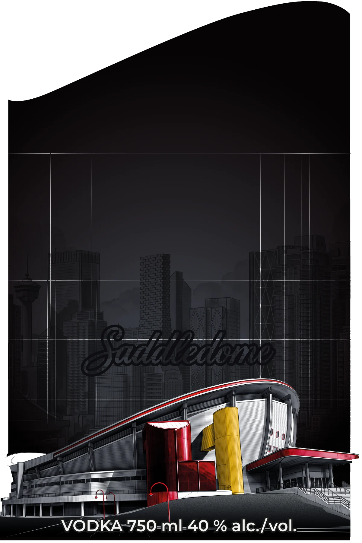
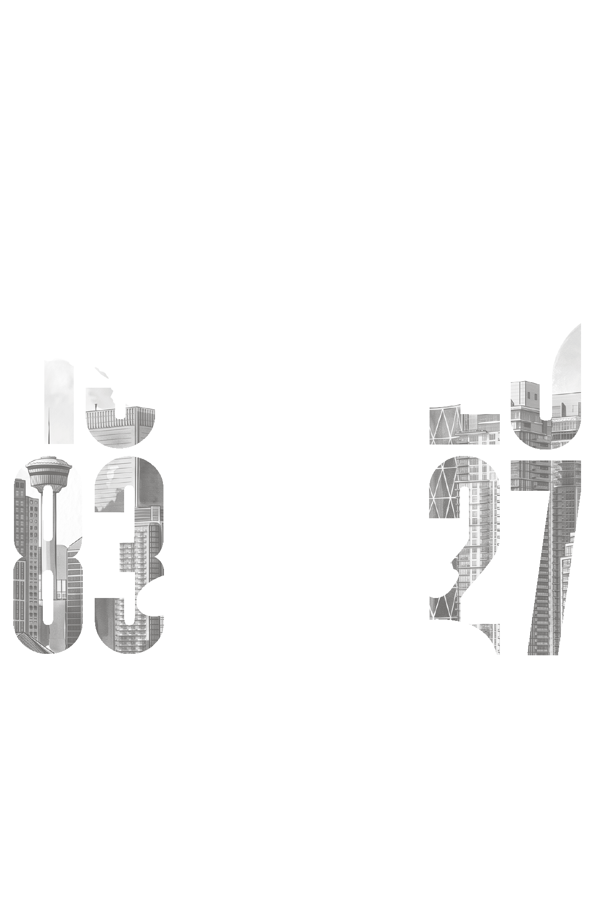

- Matte base #0E0B0CFour-colour process on matte stock. The skyline, the Saddledome, the script tone on tone, the legal line.
- Silver foilHot foil. The Sipp lockup and EDITION, the mark both editions share.
- Gold foil #C39255Hot foil. 1983, the Flames mark in outline and the Saddledome script.
- Red foil #CF102DHot foil. 2027 and the solid Flames mark.
- Ink on foilProcess ink printed over the foil, so the skyline shows through 83 and 27.
- Raised varnishRaised UV you can feel on the lockup, the numerals, the mark and the script.
- DieCut to its own contour, 4 in by 6 in, the stock round it lifted away.
One system, not four briefs.
Strategy, identity, voice and guidelines run as one process with one team, and they end as one document. Here are the four, as the chapters of the guide we wrote for Highwood.
Strategy
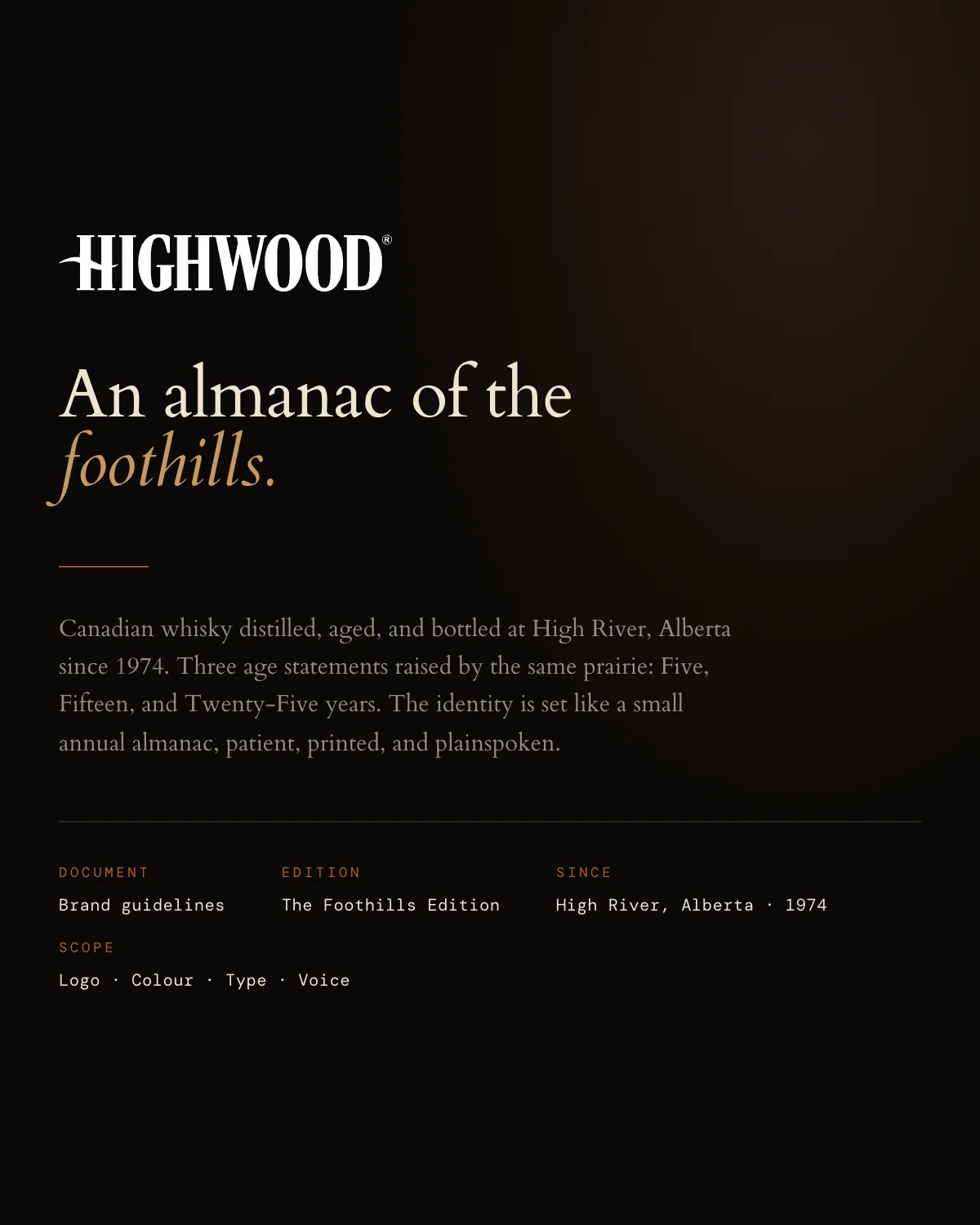
The cover Positioning, audience and the story. What the brand stands for, and what it has earned the right to say.
- Brand strategy
- Naming
Identity
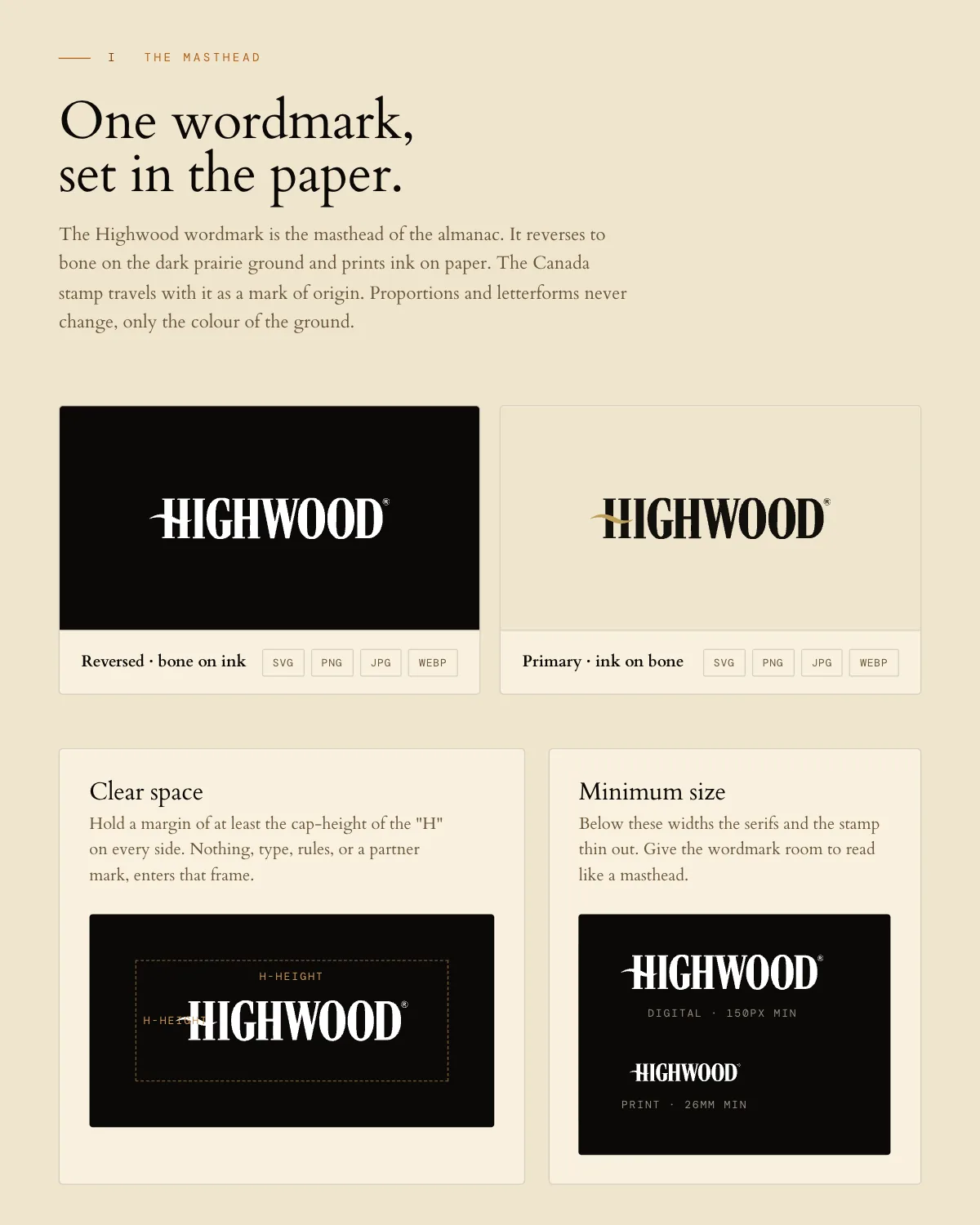
I, the masthead The mark and every lockup, colour, type and photography direction. A system that reads in two seconds on a phone.
- Logo and mark
- Colour system
- Typography
- Art direction
Voice
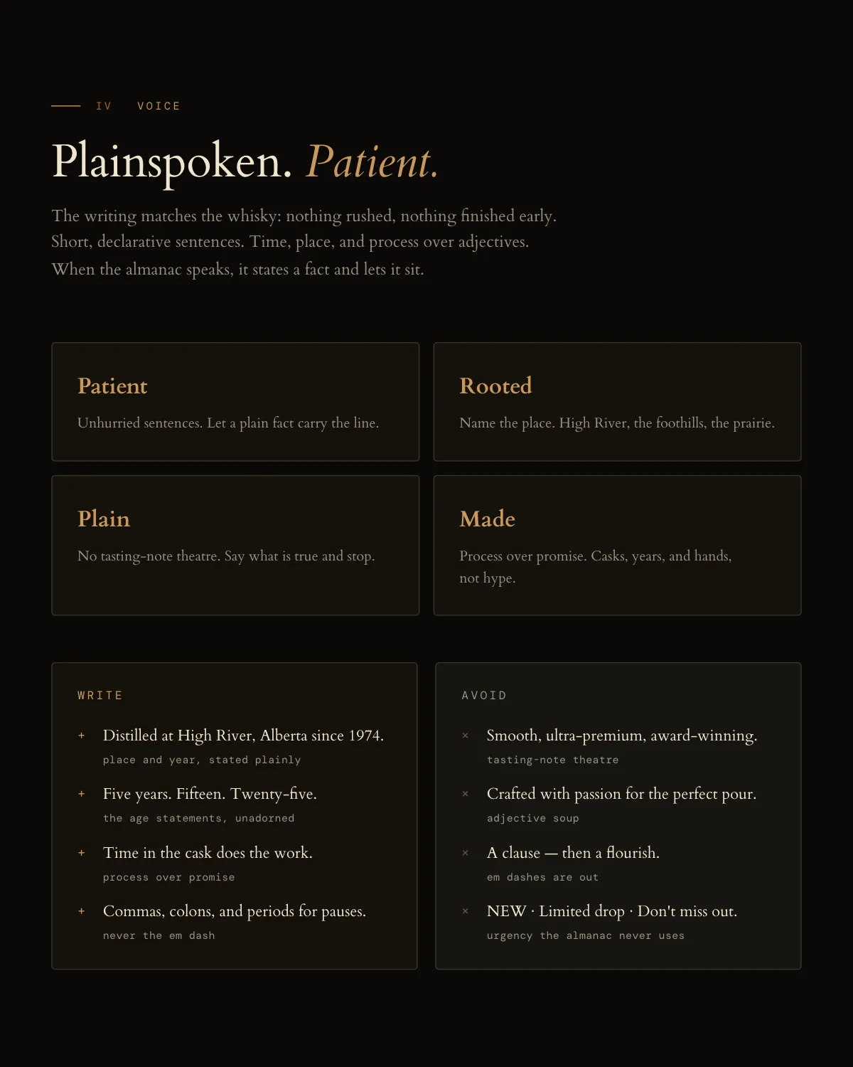
IV, the voice The messaging, the tagline and the tone, so the homepage and the ad hook sound like one brand.
- Voice and messaging
Guidelines
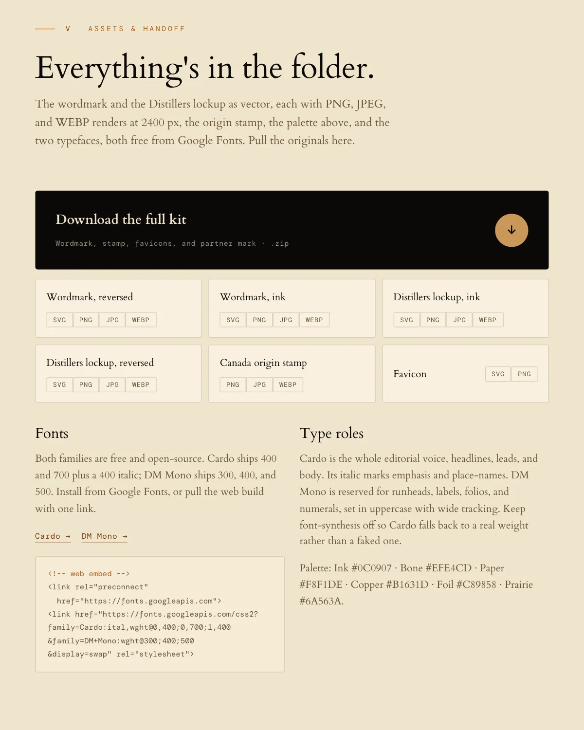
V, the folder One living document for ads, web, print and production, with every source file, so a new vendor ships on brand the first day.
- Brand guidelines
Centennial 33
A crest, a wordmark, and the number.
The release identity for a 33-year Canadian whisky, eight hundred bottles numbered by hand. One crest signs the label and the box, and the guide we wrote keeps it that way.
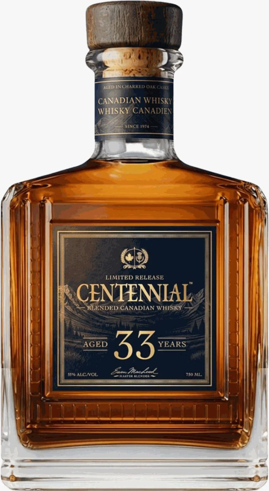
Label The crest at its head 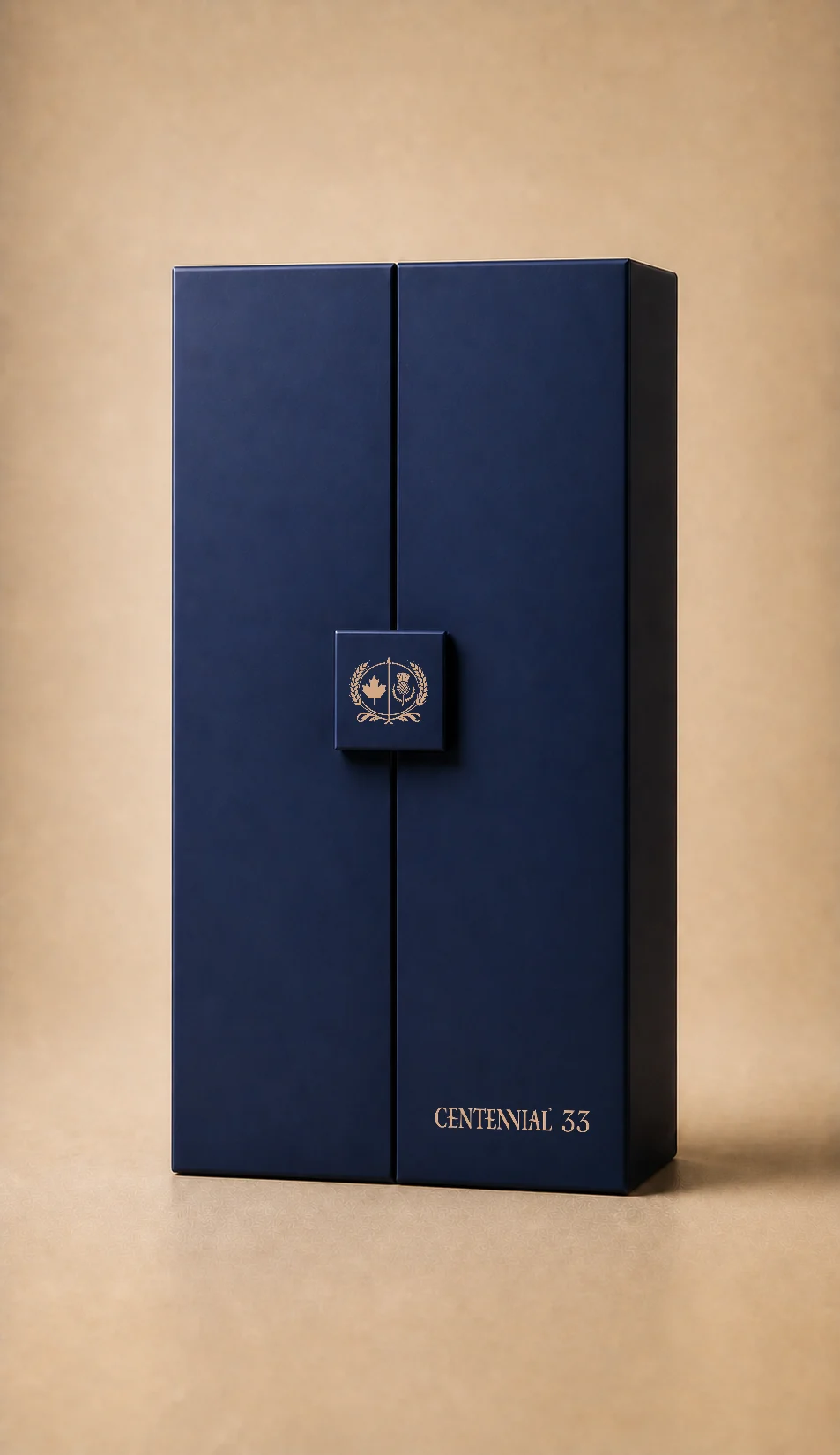
Box The crest on the clasp 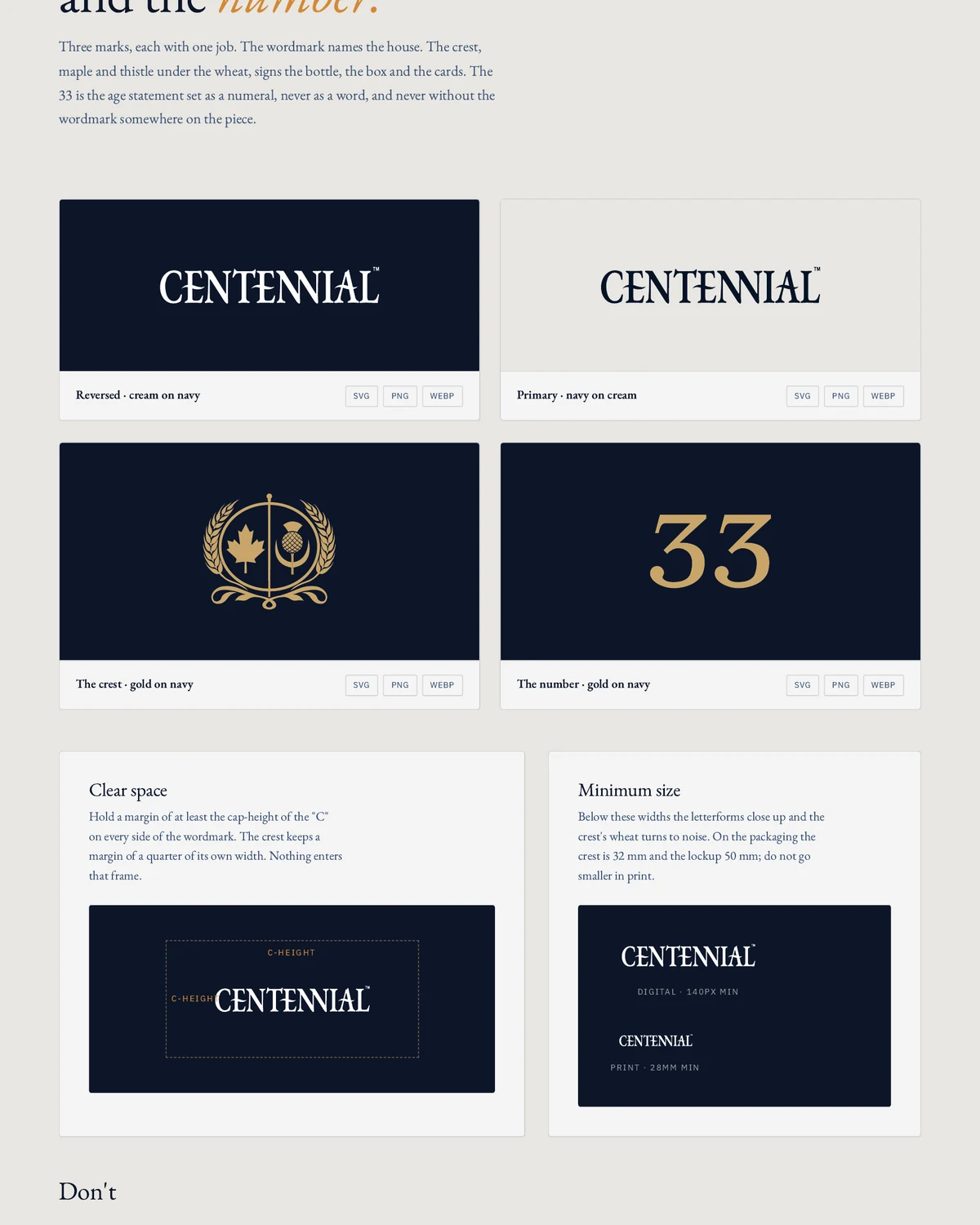
Guide The crest, gold on navy
Wordmark Names the house.

Crest Signs the bottle, the box and the cards.
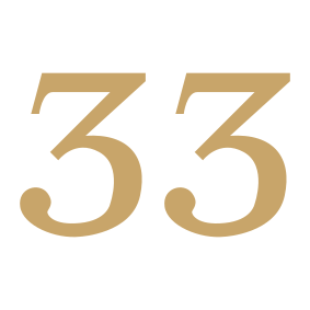
The 33 The age, as a numeral, never as a word.
Navy, cream and one gold.
- Centennial NavyHex #0D1629RGB 13 22 41The ground under everything. The label, the box, the site at night.
- CreamHex #E8E6E1RGB 232 230 225The reading surface, and the cards inside the box.
- Label OchreHex #C0A874RGB 192 168 116The one accent. The crest, the number and a rule, nothing else.
- Deep navy #051326
- Box navy #1F283F
- Mid navy #3D5477
- Amber #D38937
- Rust #893400
- Warm ivory #EAD9C0
The voice counts things.
- EB Garamond 400The age, as time

- EB Garamond 400 ItalicThe process, in five words

- EB Garamond 600The edition, counted

- IBM Plex Sans 500The labels, wide and small

Highwood Distillers
An almanac of the foothills.
A distillery at High River since 1974, given a system it can run on. The wordmark is the masthead, one serif carries the voice, and the photographs are of the real plant.

The Foothills EditionHigh River, Alberta, since 1974
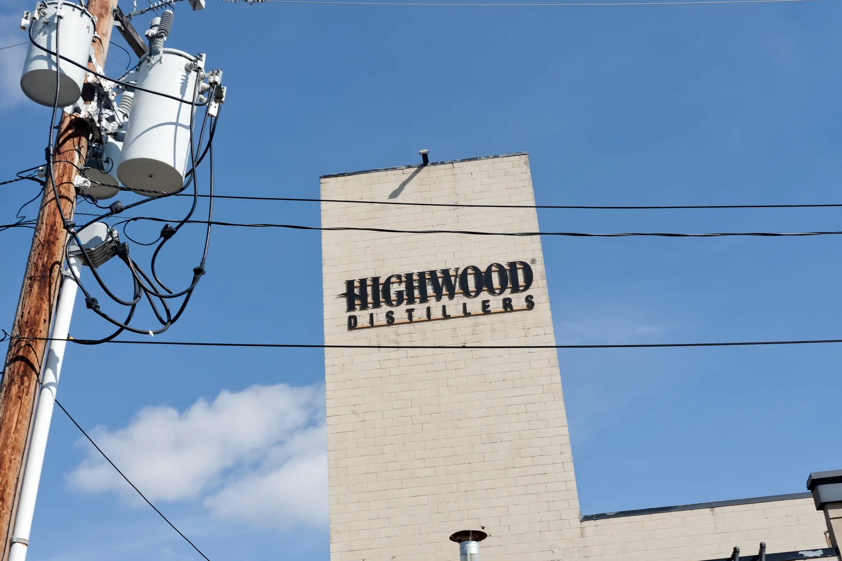
I The wordmark on the tower 
II No additives, no shortcuts 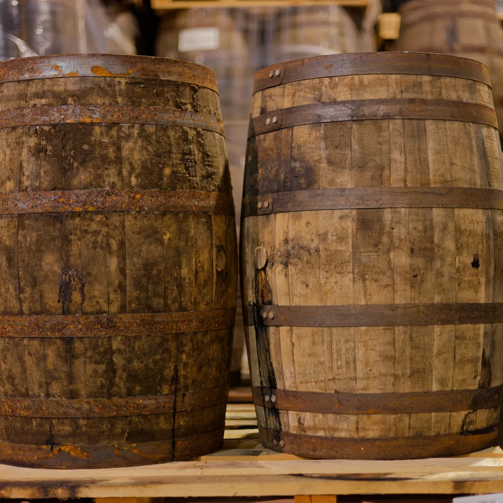
III Time in the cask 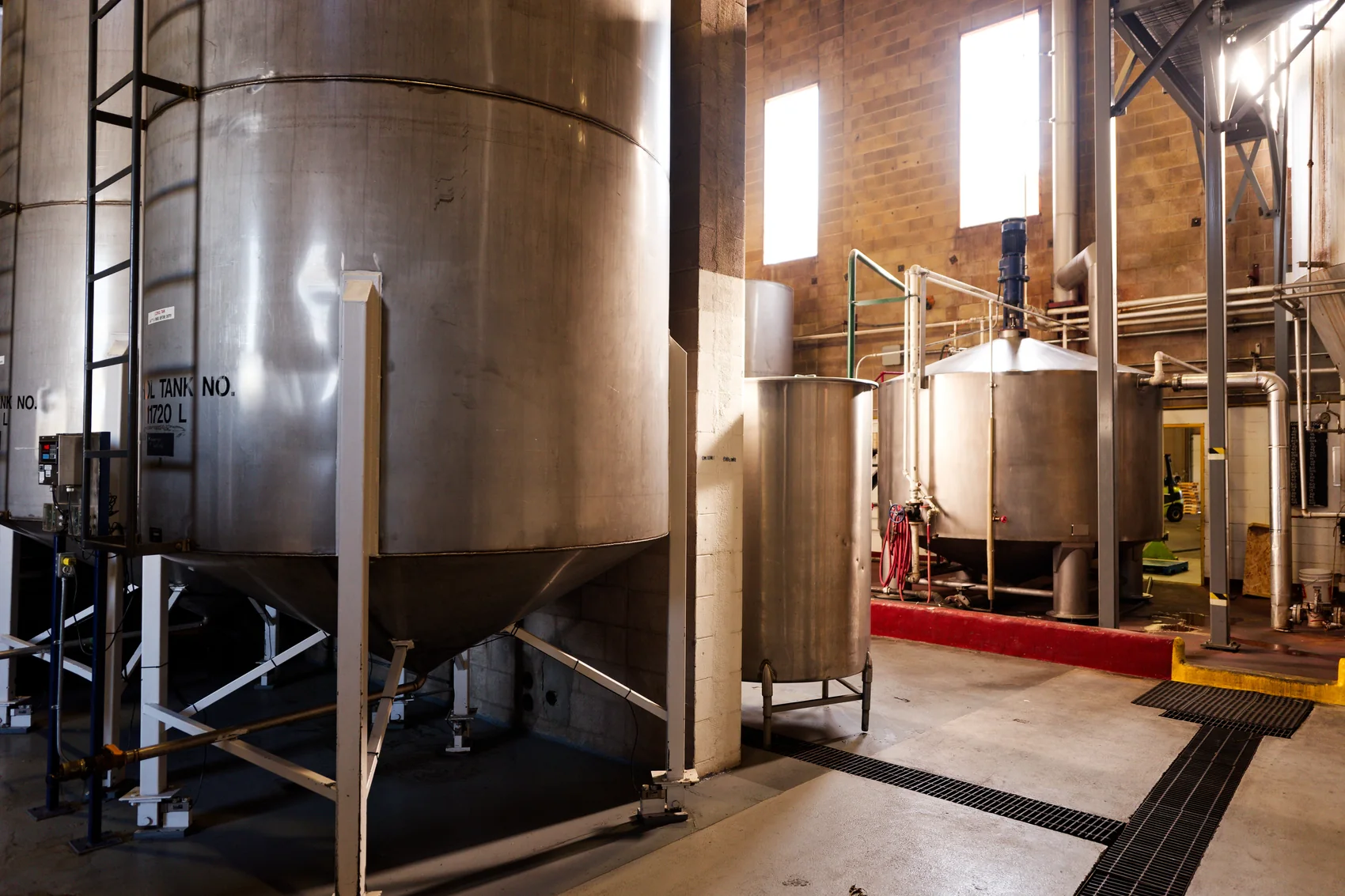
IV Distilled at High River
Plainspoken. Patient.
Short, declarative sentences. Time, place and process over adjectives. The almanac states a fact and lets it sit.

Writes
- Distilled at High River, Alberta since 1974.Place and year, stated plainly
- Five years. Fifteen. Twenty-five.The age statements, unadorned
- Time in the cask does the work.Process over promise
Never writes
Smooth, ultra-premium, award-winning.Tasting-note theatreCrafted with passion for the perfect pour.Adjective soupNEW · Limited drop · Don’t miss out.Urgency the almanac never uses


From insight to identity.
Discover
Workshops, stakeholder interviews and a category audit, so the work starts from customers, competitors and commercial goals.
Position
Positioning, audience and the story, and naming if it is on the table. The frame the rest of the work hangs off.
Design
Two to three directions, each built out enough to judge. One goes on to full construction, the mark, colour, type, photography and motion.
Voice
The tagline, the messaging, the tone and a copy library, so every channel reads like the same brand.
System
The guidelines, an asset library and a launch kit, so your team runs the brand without calling us for every decision.
8 to 12weeks for a full brand system
4 to 6weeks for a refresh, or an identity on its own
Priced for each project.
Scope follows the stage of the business, not a package tier, and every project is quoted up front, before the work starts.
FAQ
Questions we get asked.
How long does a brand project take?
A full brand system (strategy, identity, voice, and guidelines) is typically 8 to 12 weeks. A lighter refresh or identity-only project is usually 4 to 6. We'll scope it once we see what you're starting from and where it needs to get to.
Do you do strategy only, or identity only?
Yes to both. Some clients come in with positioning already nailed and just need the visual system. Others have a strong identity but the strategy isn't sharp. We work in pieces when that's the right call.
Is this for new brands or existing ones?
Both. We build brands from scratch for new companies, refresh positioning for mature ones, and systematise what growing brands already have so the work is reproducible across teams and vendors.
Do you handle naming?
Yes. Name generation, shortlisting, linguistic screening, and a first-pass trademark check. We work with IP counsel when it's time to clear and register, but the creative and screening sits with us.
What do we actually walk away with?
A brand strategy document, a logo system with full file variants, a colour and typography system, photography and motion direction, a voice and messaging framework, and a guideline document your team and outside vendors can actually run on. Plus every source file.
Can you run the brand after it launches?
Yes. Most branding clients move into a retainer with us for paid media, content, web, or production, so the people who built the brand are the same people making the ads and running the site. That's the point.
How do you scope a Calgary branding project?
Scope tracks the stage of the business, not a package tier. A small-business identity assumes positioning and voice are settled. A full brand system adds strategy, voice, and guidelines. Naming, photography, and motion extensions are scoped separately. We quote every project up front with fixed scope and fixed price. See our full Calgary branding cost breakdown or our guide to building a standout brand for the full picture.
How many logo directions do we see before picking one?
Two to three directions, each built out enough to evaluate properly, not just mood boards. We land on one and take it to full construction: primary mark, secondary lockups, and responsive versions for small spaces.
What's the difference between a logo and a full identity system?
A logo is one asset. An identity system is the mark plus the rules: colour, type, photography direction, motion principles, and a guideline document, so the brand looks the same whether it's an ad, a storefront sign, or a slide deck.
Do you only work with Calgary businesses?
We are based in Calgary and work with clients globally. The process stays the same wherever you are: discovery, positioning, design and voice, then a system your team can use.
Read next.
- NoteHow much does branding cost in Calgary?Prices published by 13 Calgary studios, from a logo to a full identity with a guide.
- NoteColour psychology in marketing, what the research supportsThe 80% brand-recognition stat has no study behind it. What the colour research does support.
- NoteLiquor brand marketing in 2026Platform rules, retail and DTC shipping, and how a spirits brand grows inside them.
- CalgaryBranding in CalgaryBrand strategy, identity systems, voice and rollout for Calgary businesses.
Starting a brand, or fixing one?
Tell us where it stands. We'll say what it needs, and what it doesn't.